Printing the Image - Old Work Part 1
Ann had a 4 day weekend over the Fourth of July, and we took advantage of the extra time to wok on some images and, more importantly, print some images. So many images, in fact, I’ve decided to break it up into two blog posts.
You should already be familiar with Ann’s first image. And while it looks almost the same on screen (especially if you don’t compare them next to each other), the prints are significantly different. How? Well, the red glow off the canyon, both in the mid-ground and the farther mountains seem to really glow and add a presence to the image that the previous print didn’t have. And Ann managed to calm down the foreground items that were lit to give the image some balance as well as lighten the path that led downward from the point.

It is now a truly lovely print.
Which is what you have to say about Ann’s other image - another flash from the past, this time from our Death Valley trip. it was an image where she’d mastered an incredibly textural foreground and dune area, and overcome a horribly washed out sky, but was left unsatisfied with what had appeared to be a blank dark mass of a distant landscape.
While it worked in its own way to offer a stark contrast with the bright mid-landscape dunes, we’d discussed that there was detail in those hills (I really had to resist not saying “there be details in thar hills”) and that it might be interesting to see what can be revealed.

I’d forgotten about that conversation, but Ann hadn’t. As I was working on an image Ann came walking in and said, “Can you come in and take a look at something?” The texture of the landscape is amazing, and she kept the dark moodiness of the background hills, which adds to the lightness of the sand dunes. The quality of the tonal values comes close to wet-darkroom silver-based papers. And she immediately wanted to print it on larger paper. It’s stunning, simply stunning.
I used my time as an opportunity to revisit our last year’s fall trip, in preparation for this year’s fall trip. Since I imported my RAW images from Lightroom, everything was in its virgin state, so I was pretty much starting from scratch with each of the images. It took me a while to come across images I wanted to work on, with the aim of ultimately printing, but after a while several caught my eye.
The first was a simple image, necessary in part because I’ve been so negligent in my photo processing. I’m basically having to re-learn my darkroom tools again (I really can’t wait to be through this period of juggling so many different things). I wound up printing this aspen on a matte paper (part of a large order of the wrong paper [I wish companies would have clearly distinct names for papers and not name them similarly]). It’s appropriate for the paper. I also printed it on a baryta paper and while it is naturally more vibrant, the matte paper image has a calmness to it that may prove useful on other images.

I decided to stick with the aspen theme (avoiding some of the obvious favorites from the Pando Forest) and focused on one that I hadn’t been satisfied with from my previous efforts. Those had proven too harsh and moody, so I decided that, since I was starting from scratch again, I would take better care of avoiding that feel.
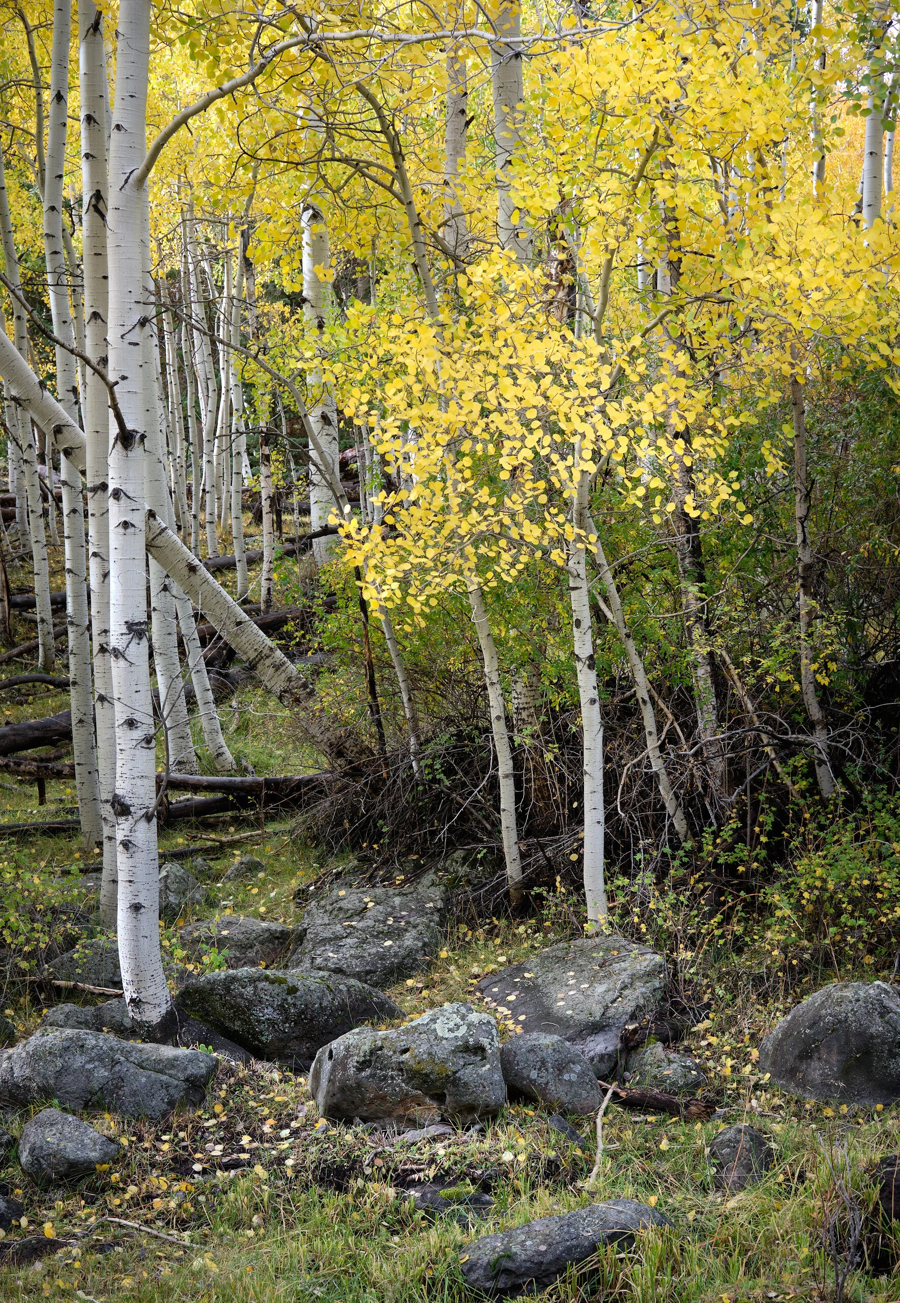
This image took a lot of work, which was good because I needed the practice. I did some adjustments, wiped them out, tried other things, kept them. Bit by bit I worked the image because it was one I’d immediately seen from my driver’s seat in Beast and i could still feel why it caught my eye.
I kept returning to this image while I worked on other images to see how it felt. And often I would make an adjustment here, tweak something else there. I must have returned to it 4 or 5 times that afternoon. But it was worth it because the print is exactly what I wanted it to be. It’s quiet and subtle, but captivating and rich with detail. And it has that sense of light (even on an overcast day) that you get in an aspen forest.
Next . . . more images!