Working on the sky.
The last blog post left off with me unsatisfied with the sky in the black and white image. Well, once something like that gets in your brain, it’s hard to let go of, so the easiest thing for me was to take some time with the image and to see if I could improve it. And this is the result.
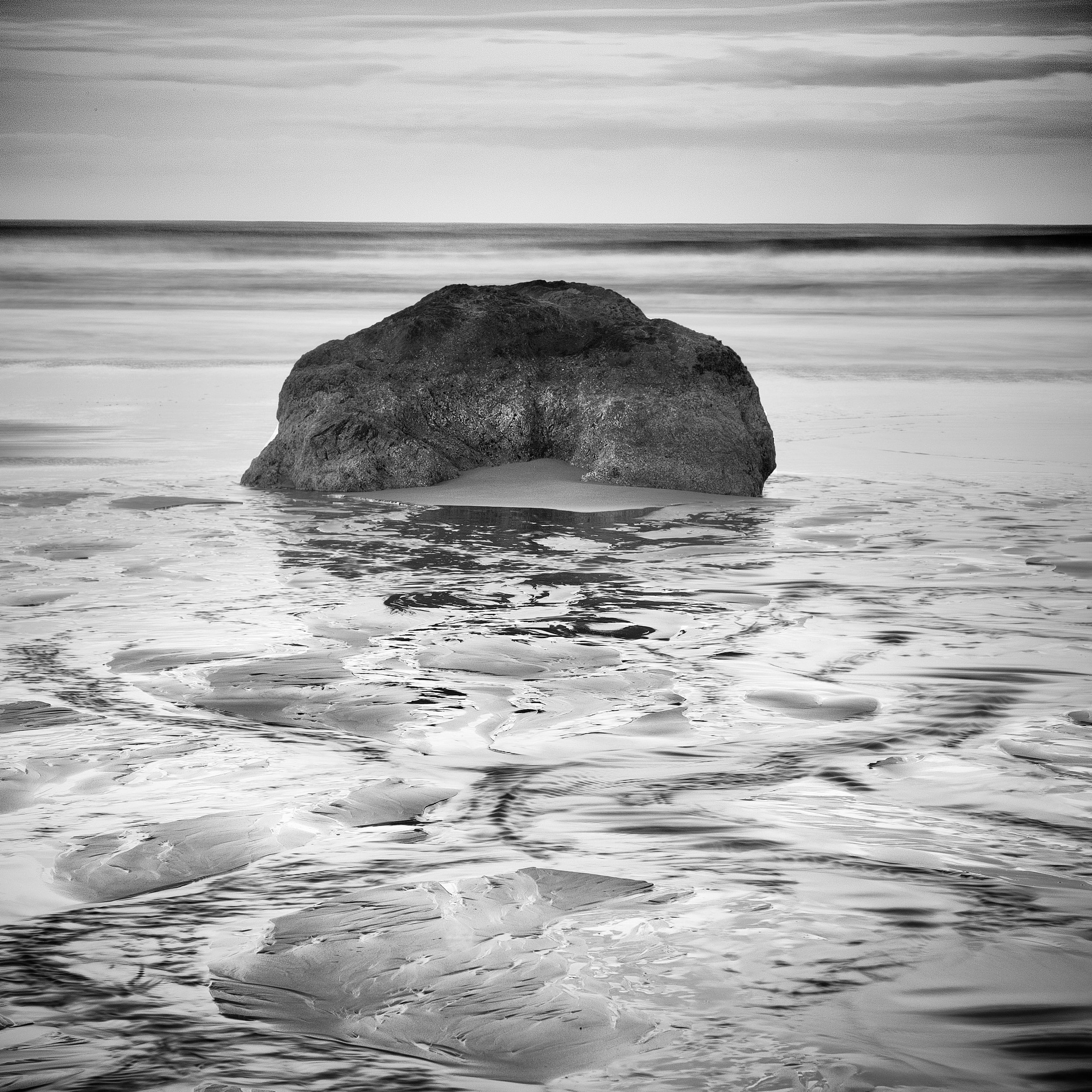
While the change is not much, it’s sufficient to satisfy my disappointment with the previous version and, to be honest, it’s much less dramatic than I could have made it once I figured out how to separate the subtle tonal values. That means this version is an intentional choice. Basically, I wanted it to still feel real while offering some substantive texture in the sky. Only time will tell whether I’m satisfied with it, or whether it should be intensified or softened.
It wasn’t as easy a fix as I’d imagined (even though I had tried and failed a couple of times previously). It involved working on the color saturation (figure that, changing things in black and white by changing the values of the colors in the raw image - definitely something I could not do in the black and white (wet) darkroom), as well as several different tools (each acting on a certain aspect of the tonal values and their relationships) to find the right combinations to my eye. By then, the vignette felt way off, so I tried adjusting the vignette and realized the vignette for the top needed to be different than for the bottom, thus introducing a whole new set of fixes (one brush technique took 3 tries to get right).
And all of that really doesn’t matter. What matters is the image - either it’s better or it’s not. I think it is. Well, at least for now I do.