Printing the Image - Ann’s Selections
Now that Ann has finally unburdened herself from the website launch, she’s been spending a bit of time looking at some of the images she came across as she was putting her portfolios together. She, of course, is also testing out some software to address some of Capture One’s shortcomings in terms of metadata and notes for images. For her, that means revisiting a lot of older images (to test on in case things go horribly wrong) and, ultimately, looking at them again with fresh eyes. That is always a good thing, even though it can be a bit depressing. The positive reframe of that last statement is that it can help you realize just how you’ve improved in your photography.
Every couple of days Ann will ask me questions about this image or that, particularly ones she takes some time to develop further. Do that enough times and you have a collection of images that should be printed (at least in my view). So we decided to do a printing session last weekend.
Ann’s selections were a bit of a hodgepodge, given that they come from a range of years. One was an image we both though should be printed. The others were what is best described as a genuine inquiry as to how the image would look in a print and, more importantly, could a print contain some of the qualities of the images that are quite appealing. Those are very splendid reasons for firing up the printer.
The first image we printed was one Ann made during our last visit to Goblin Valley State Park in Utah. It was the pre-dawn photograph we had scouted the afternoon before, a morning that I had success with photographing towards the moon and sunrise in the direction opposite from which Ann made her image. My images were made about half an hour earlier in near darkness, on the walk out to where Ann set up. Once the sun started to rise, the skies became a very odd color and, combined with the reddish soils on the ground, made for some really strange images. My photographs from that time, looking about 90 degrees to the right of Ann’s, look really strange. So it was no surprise that hers did too.
Ann wasn’t very happy with the color image (it was not a white balance error), and decided to see how it looked in black and white. Her image makes me think I should revisit mine as well, because the black and white image had the qualities that made the scene so appealing that morning.
As is so often the case with Ann’s landscapes, we decided to print it a bit larger, to give that open landscape feel that smaller prints often can’t convey. Wow! The image captures the soft-pre-dawn light, the incredibly rich textures of the Goblin Valley soils, and the spaciousness of the landscape that led Ann to decide she wanted to photograph from this location. None of my images from that morning have that same sense of openness. It was one of those times where a scouting trip paid off.

The more we print, the more I think Ansel Adams was right in stating that some images tell you how large or small they need to be printed. Stepping up a couple of paper sizes for this print was a very smart move. Also, from how far away you look at the image matters. And if you stand about 2-3 feet back (a bit past arm’s length), the image comes alive and is almost three-dimensional. A true work of art!
The other two images Ann decided to print (one of them at my recommendation) are very different. They are more intimate landscape images and print size likely doesn’t add a whole lot to what they can contribute. They’re also both rich with color. We printed the first of them to see what could be conveyed in a good print. If you look at the image below, you’ll see a range of water characteristics that, to be honest, I wasn’t sure could be reproduced on a page. We’ve printed rushing white water in the past, so we knew that would print well. Everything else, well . . . there’s a lot to see. First off, in the upper center is the sunlit water with flakes of gold in it rushing over a rock. Then there’s the hazy flow of water, with streaks of bubbles wrapping around that same rock. As you move down in the frame, off to the right edge are some ripples with golden streaks, again reflected sunlight.
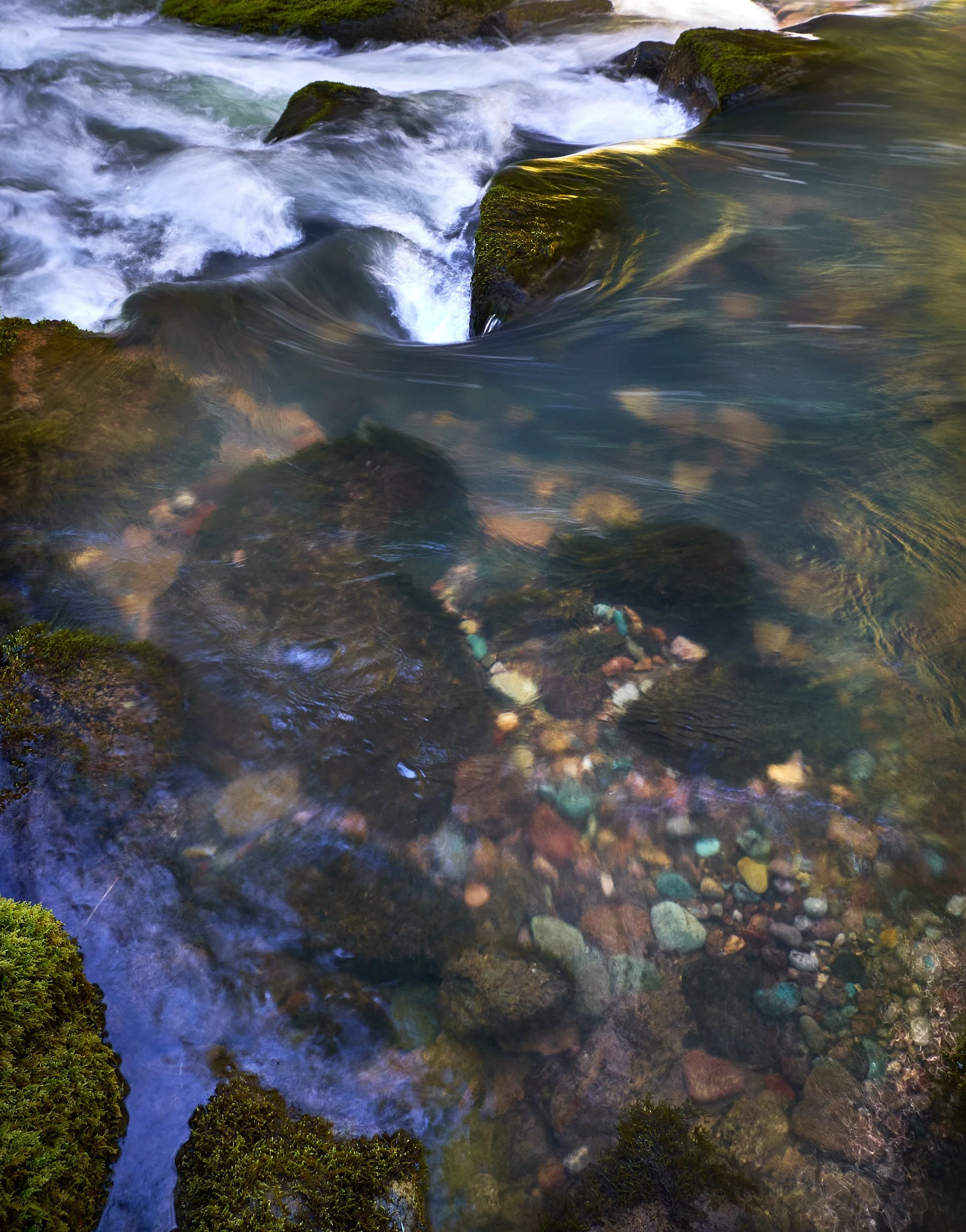
And then there are the small pebbles on the creek bed, revealed under several different “conditions.” Towards the center of the frame are some fairly distinct colored rocks nestled within the bigger boulders. Moving downward are some hazed out, blurry rocks with streaks of reflected light showing the path of the water above. Then, down a bit further towards the right are very clear rocks, each very distinct. Finally, coming to the edge where, again, riffles in the water are reflecting strands of gold reflected light. Off to the left corner, is reflected blue sky.
Much to my surprise, it all turned out. In fact, the golden lights on the bottom right corner shine in the print even more than on-screen. And the upper center rock just glows. It is an impressively beautiful print, to say nothing of the equally lovely image. To capture that range of conditions in a well-composed image is quite the accomplishment. To have it all come out in print is amazing.
Ann’s final selection was another one of those “will this print well?” Type of images. Ann’s focus in making this one was the green mosses on the rocks, which we were both fairly confident a print would reproduce well - the coloration, the textures and the subtle light variations almost beg to be printed. What we were unsure about were the two sets of falls that wrap around that subject and the sunlit portions at the top of the frame.
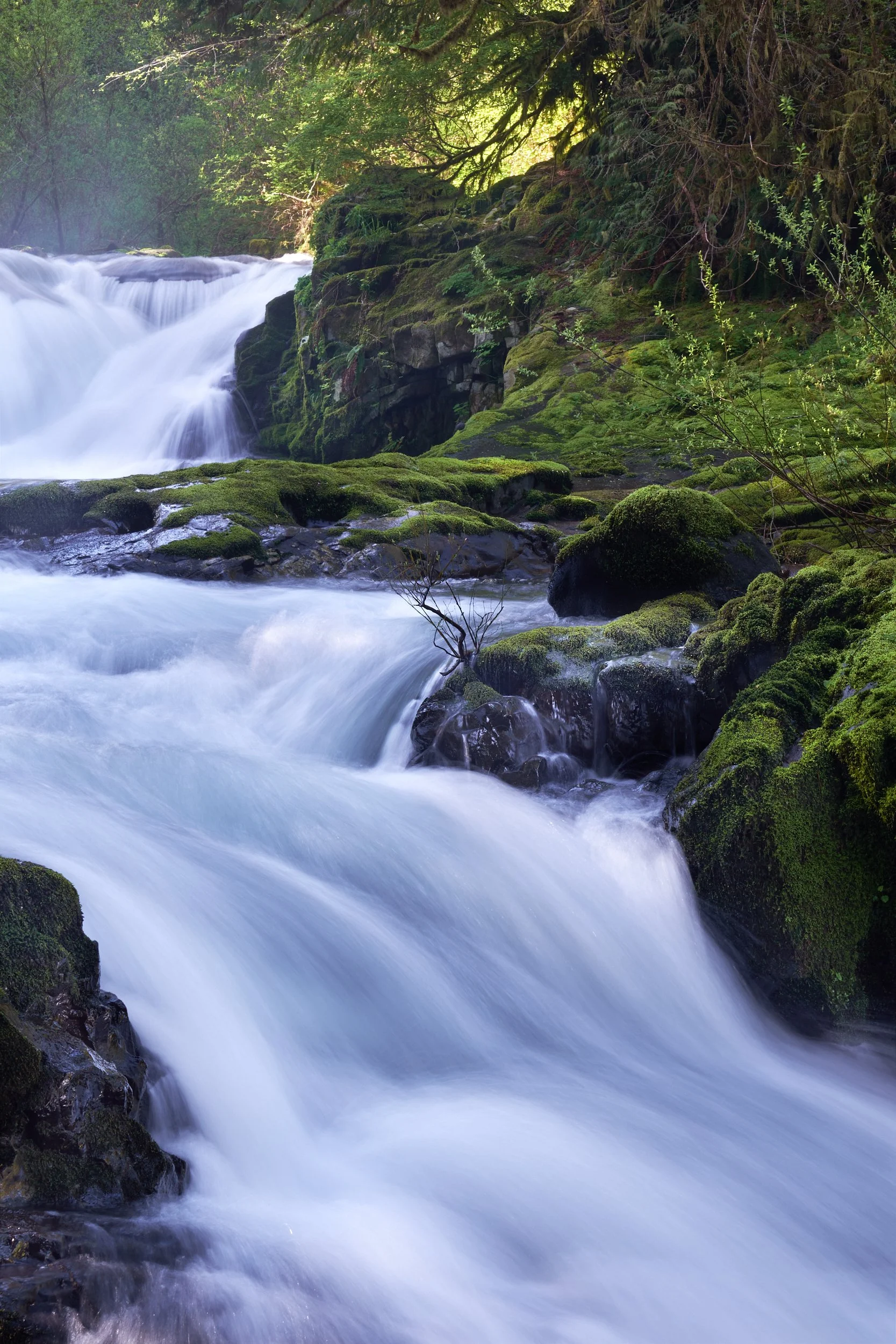
Once again, the print is stunning. We were right about the wet moss, you can almost feel it. The flowing water is impressive too. It contains a richness of color and diversity of lighting that you may not quite realize when looking at it on the monitor (look to the lower left corner - you see sunlight reflecting off splashing water; look to the far side up a bit - it’s there too, and in the upper frame as well - all plainly evident in the print). Even the upper set of falls conveys a sense of flowing instead of the non-textural plain white streaks that happens when the photographer is not sensitive to the shutter speed necessary to convey not just flowing water, but the water’s character as well. Here, the water is rushing forcefully, but still has some body and texture to it.
And the sun-lit portions of the image please as well. The print simply radiates by the tree trunk, and the light glows through the tree branches. And what I find particularly pleasing is that above the creek the light has captured the mist. Looking across that part of the print you see three different types of lighting. It’s just lovely.
So, despite the fact that a couple of images were printed to learn what the printer could do, it turned out that all three images printed well. That’s what I call a good printing session!