Stone Town Man - Joe Cornish Edit
When I was a kid, there used to be a game show called “Name That Tune.” Strangely enough, they’ve apparently brought it back in 2021, though for the life of me I don’t know why. Anyway, the contestants were given some background about a song and then they competed with each other to identify the song in the fewest number of notes. It used to baffle me when someone would say, “I can name that tune in one note!”
Well, that’s what this post is about. Actually, it’s about doing something I’ve blogged about before. In one of my posts I’ve mentioned that Ann and I watched a YouTube video where Joe Cornish discussed his approach to developing his images as trying to use as few development steps as possible. As many as is necessary, but as few as possible. Sometimes that’s impossible to do, but other times it’s not. The question I asked myself at the end of making the previous Developing the Image post, was could I achieve what I wanted for the image in fewer steps?
You see, the last image took 11 layers in addition to basic background adjustments to make. At the end of making all of the images for the blog post I really got to wondering whether I could have done it in fewer steps (even conceding that the last two steps were to correct previous bad decisions, so let’s call it 9 layers). In theory, I now understand the qualities of the image better and what I want the final product to be so . . . conceivably I should be able to do it in fewer steps. I guess the question was whether all of the smaller detail manipulations were necessary. So I decided to start from scratch and re-develop the image!
To remind you, this is what the last process ended up with.

As discussed previously, I started out with overall adjustments to the base layer. This time, however, I focused on getting the back of the alley as close to “right” as I could, knowing that it would make the rest of the alley way too dark. I’d deal with that later because I knew the information was there to work with.

Later being the very next step. Because the man is my primary focus of the image, I started with a giant radial on the left side of the frame. There I controlled all the different exposure values I needed to, and added a significant amount of clarity and structure to bring your eye to that part of the frame. Granted, it meant including the textured portion of the bottom edge of the frame, which I had avoided last time, but I hoped that it wouldn’t have too much visual pull.

I was impress with the results with just that one edit.

My next layer focused on the wall to the right. Oddly enough, I didn’t focus on that wall the first time around, but this time it looked too dark, especially when compared to the wall where the man was standing, which meant it needed a bit of work. I attribute that to the fact that every adjustment you make influences how you see the surrounding areas and because this approach was drastically different than the one I used previously (I made major changes in one big area this time as opposed to more localized adjustments) last time, the right wall needed work in this version whereas it didn’t need it last time around.

I didn’t really do too much to it other than increase the light values a bit and to add some structure to it (I really want the word “BAD” to be visible).

I was already feeling like I was getting to the details and the only thing that seemed really out of place was the upper wall in the distance. So I brushed the brighter parts of that upper wall and darkened them a bit.
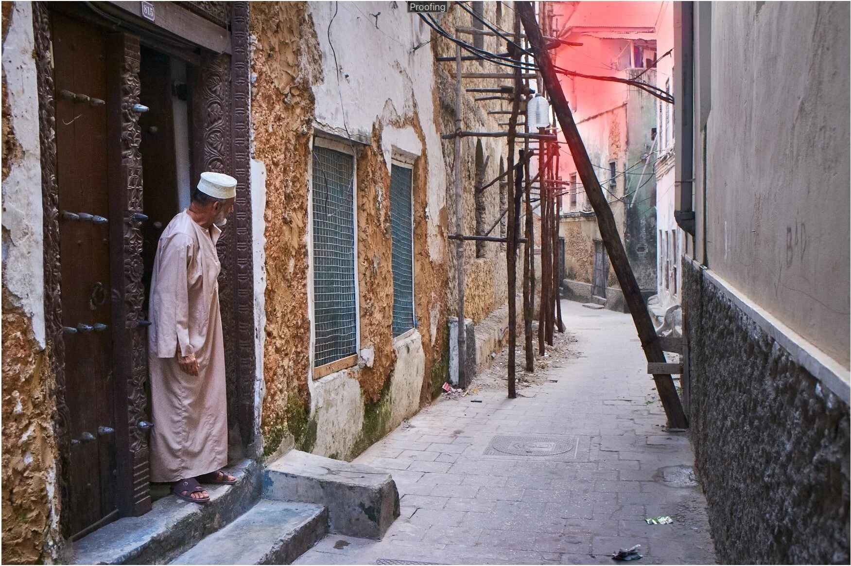
Things were looking pretty good so I decided I needed one final touch.

And you guessed it - a brush of clarity and structure. Again for the same purpose as the last time around, to emphasize the man, and to help lead your eye to the destination at the end of the alley.

And that was it. Joe, I can develop this image in 4 layers!

So the question is, Is the upper image better, or the lower image better?

I’m not really sure there is a definitive answer to that question.
I think the image from this session conveys more of how that alley actually felt that morning, and if I were to do a fifth layer, I’d do a radial on the man to lighten the folds of his gown a bit more. And maybe go back and work on the clarity/structure layer a bit more. The first development has more of a consistent character with the other images in the Stone Town, Zanzibar portfolio, so in that respect it is “right” for its purpose as well. Part of the reasoning for the slightly different development process as a stains-alone image is that this was the very first image of the morning and was taken as the sky was quickly brightening from dark to low-morning light, so I had to lighten things up a bit more than the others so that it would be more compatible with the other images it would be seen with. As a stand-alone image, having a slightly gloomier alley worked just fine. The reality is, some of the alleys in Stone Town are pretty dim, even in mid-day.
Ultimately, I think both interpretations are right for their purpose. And that’s what it is when you approach developing an image from scratch - your interpretation of that image right now. Ansel Adams discussed how he was much more “aggressive” as an older man in his printing than he was in his youth. For example, he says the later prints of Moonrise, Hernandez, New Mexico he printed the skies nearly black, while his earlier prints were a dark grey.
I guess what matters the most is that this revisiting process was a good learning exercise for how minimize the steps necessary in interpreting an image. I suspect thinking that way will make developing less complicated images much easier in the future. At least I hope so.