Printing the Image - January 3, 2021
Call me a glutton for punishment, or just plain stupid. Or maybe blame it on that determination I developed from playing soccer, “So what if they kicked our ass last time, it doesn’t mean they’ll do it again!” (Yeah, I know you’re probably thinking, “Well, it doesn’t mean they won’t do it again . . . and remember, that’s what they did last time.”). But fresh after that demoralizing defeat that was my futile effort to scan 4x5 images, the very next day I decided that we should try printing for the first time ever on our new printer. Given some of the frustrating printing experiences we’ve had in the past, it really was a risk. Fortunately, things turned out a bit better than my scanning disaster. Quite a bit better.
I guess it helps to have had prior experience printing before, and to have YouTubed some refresher videos on printing via Capture One, on how to use the the Epson P900 printer and on how to use the Epson Printing software, because we had no major problems with the prints. Yes, a few adjustments were in order, but it went surprisingly smoothly.
I had downloaded the ICC profiles for the Epson P900 and all of the papers we had (well, the printer is so new that one company hasn’t come out with ICC profiles for their papers yet), and we stuck with just one paper (always a smart move when testing). We also had recently calibrated our monitors and then re-developed each of the images using the ICC profile for the printer-paper combination we were using. The goal of the session was to do just that - test the printer and the printing process with a range of images that reflect a variety of image conditions.
As is too often the case, I had several images I wanted to print - namely because I’ve been thinking of several portfolios I’d like to print - but getting Ann to believe that any of her images might be worth printing was like pulling teeth. After much pestering, Ann finally relented and wound up printing more images than I did.
Although we printed most of Ann’s images first, and then added another image after I’d printed mine, I’m going to flip back and forth presenting them below.
I’m glad Ann selected a photograph from our trip to the Redwoods when it snowed on a nearby ridge. White snow is extremely difficult to print and not have it look muddy. Here, I have to admit that the printer did its job, adding ever subtle shades of “white” that gave texture and substance to the snow, yet left it “feeling” light and fluffy (and cold). Between that, and the incredible level of detail the printer was able to produce in the bare tree branches, I was quickly convinced we’d made an excellent choice in printers after the very first print.

My first print was from the Pando forest and in selecting that image I wanted to test that same sense of “whiteness with substance,” except this time in white aspen tree bark. Another thing I was hoping to check was how the printer handled subtle shades of bright colors - in this case the bright yellow leaves of the small tree. Again, the printer did not disappoint. You can see each leaf in the print. And, after having seen Ann’s print from above, I wasn’t surprised to see the clearly differentiated tree branches throughout the print.

The next couple of prints are Ann’s and were taken from another area where we like to photograph - the coast. The first print (corrected in the image below because Ann cannot let a flaw pass uncorrected) was a lovely pre-dawn shot with soft dark shadows and a lovely texture in the sand. Again, the shadows, which often can turn to mud in a print, were well-detailed and the variations in color in those areas was maintained as well. So far so good with the printer.
What needed correcting was the moon. Ann had burned in the moon so you could see more texture in its face. But while it looked fine on the screen, in the print you could plainly see the edges of the burn, even though the print was no larger than the image appeared on her monitor. Again, this is a testament to the quality of the printer - a good print is unforgiving of any errors in technique. It forces you to become a better darkroom technician as well as force you to perfect your technique in the field while making the initial exposure.
The print also exposed a lesson in color that Ann and I are slowly learning to see before we hit the print button. Shadow areas often have a cool cast that the eye ignores in real life and even on screen. However, in prints, it often just doesn’t look right. Here, there’s a strange bluish-purple cast to the sand that both Ann and I didn’t notice on the monitor, but that appeared in the print. Something we will be conscious of in the future.

Another pleasing aspect of both prints was the fact that the prints retained the very subtle coloring that occurs in clouds in early morning light, particularly along the cost (I suspect it’s due to the moisture in the air).

And, of course, there’s the coloration and textures in water that both Ann and I love to work with when photographing water of any sort. All of that came out well.
The remainder of my images come from our Christmas 2019 trip to Death Valley and my thinking about doing a portfolio or two - a project that got set aside when Ann decided she wanted to retire, and then we decided that we’d do that in Portugal.
Instead of trying to work with the images I was envisioning for the portfolio, I decided to select images that didn’t fit the particular theme but that had many of the same qualities the potential portfolio images have, and that in some respects would fit the same format.
So the focus of this print was to see how the sand and shadows printed with the new printer, and to get a feel for what the right size square was for the paper size.
While I didn’t quite get the image to paper size quite right, the print itself was lovely. Exactly what I wanted.

Ann’s last color photograph was from a trip to the Painted Hills under what were very unusual conditions. After seeing her working on this image I looked at my images from that day and realized they too looked very different than normal. That was because the area had experienced quite a bit of rain, so the hills looked “heavy” and the coloration seemed quite alien for someone familiar with the place. In addition, I had totally missed the beautiful patches of sunlight that truly make Ann’s image (the print is better than the image on screen, I assure you). I had made my way around the ridge line to Ann’s left (about a quarter- to a half-mile) and had a giant mound that obstructed the light patches that Ann could see. (No wonder she stayed where she was for so long . . . .). None of my images from that day include any patches of sunlight. This image really reinforces the notion of finding where the light is special and then work with it. Those background sunlit patches are mesmerizing.

My next image was an even more close-up view of a sand dune, in this case from the Eureka Dunes as opposed to the Ibex Dunes above. This print made a good comparison with Ann’s ocean print because one of the things I remembered to do in developing this image was to warm up the color of the big sand area that is in shadow so it didn’t have such a bluish cast. While still a bit cool, it doesn’t look disturbingly so in the print, which means the adjustment worked.
As you know, both Ann and I enjoy working with black and white images as well as color. So testing the printer’s capabilities in black and white was going to be a big thing. In fact, that was one of the reasons we opted to go with Epson over the Cannon that had served us well. While Epson has always had an excellent reputation for black and white prints, their older models required you to change ink cartridges depending on whether you were printing on glossy or matte paper. Not only was that wasteful of ink, it’s a bit of a pain in the ass when, in the middle of a printing session, you decide that an image really does need to be matte (or glossy) instead of your original choice. Well, Epson fixed that flaw by installing ink channels for both types of blacks, and went a step further by improving their black and grey inks as well. With those improvements, there was no reason not to go with Epson and having purchased the printer, we had to test its black and white capabilities!
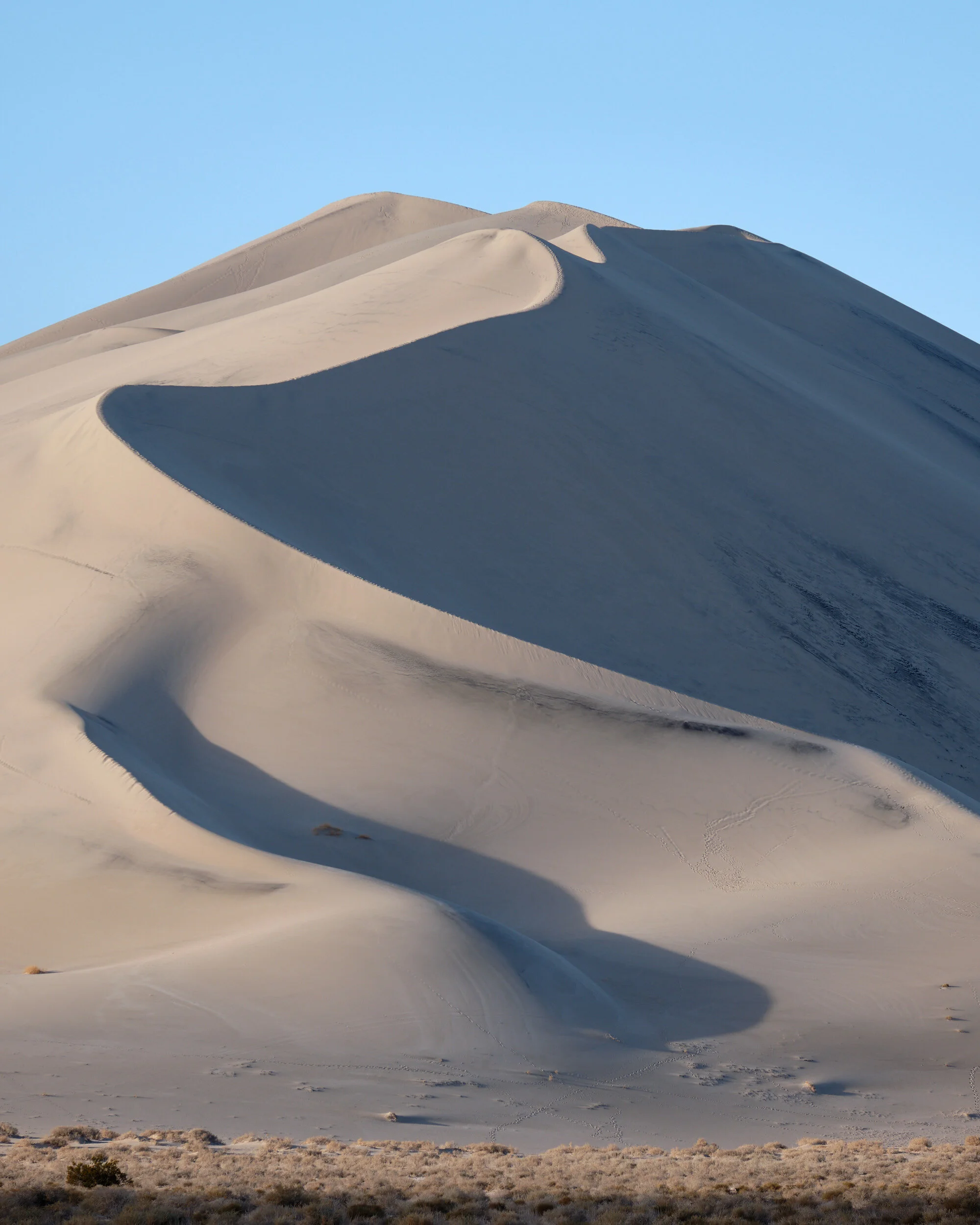
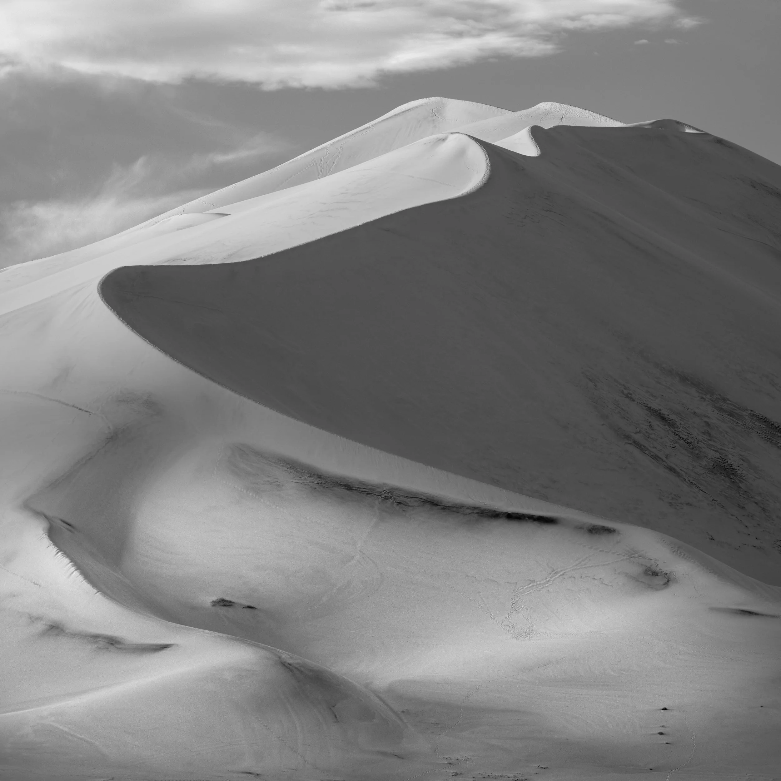
Ann chose an image from the Ibex Dunes that has a lot of wonderful qualities for testing black and white print quality. From the raking sunlight in the foreground, to the near-black shadows in the mountainside and the deep skies with wispy clouds, the print handles it all. It even maintained the sharp edge line of shadow and brilliant lit sand in the distance, with the subtle gradations in parts of the dune’s shadows. It’s an elegant print that makes me think we’ll be doing a lot more black and white printing than we did before

I was just as pleased with my print as well. I had intentionally avoided creating the dramatic skies that Ann did (though I think I might have to reconsider) and had focused on subtle gradations of grey and the perception of light in the foreground portion of the dune. That foreground area simply glows in the print.
Again, because we were testing, I’d sized this image a bit differently than the other square image and I think that’s the sizing I’ll use for at least one of the portfolios.
All in all, it was a very productive session. I’m sure we’ll learn some quirks about the printer as we print in the future, but to be able to make this many pleasing prints from our first effort with the printer was incredibly reassuring. It’s nice to know that your gear isn’t going to hold you back and that a final print can be just as incredible as an image you see on a monitor, if not more so.